
The creative team here at Zool talk about things like CMYK and RGB all day long, but if you’re not familiar with working with colour then you probably don’t have a clue what they are talking about.
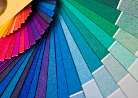
Colour is a vital part of any of the branding work that we do, and keeping colours consistent across both digital and print is vital – especially when you realise that colour is important for establishing a strong and consistent message as it boosts brand recognition by over 80%.
However, getting this consistency of colour is not easy, just ask one of our graphic designers! With the variety of different screens in use in the world and different printers, it is often the case that one consistent colour does not look the same across all of the different collateral it is used on.
The world of colour for digital and print is really complex, but in this post, we want to try and break it down a little, to help you understand the different colour modes and values, and when we use them.
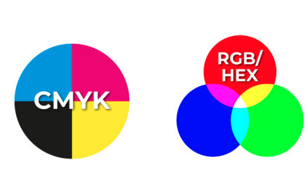
CMYK
If we go right back to basics, CMYK stands for Cyan, Magenta, Yellow and Key. It is also sometimes known as ‘four colour’ or ‘process colour’ and is easiest to think of as Blue, Red, Yellow and Black.
The cool thing about CMYK is that it is basically the process used to create any colour. We can overlap tiny dots of cyan, magenta, yellow and key to make any colour we desire. In fact, if you took a piece of printed material, such as a brochure or a business card, and put it under a very strong microscope you would be able to see a lot of little dots.
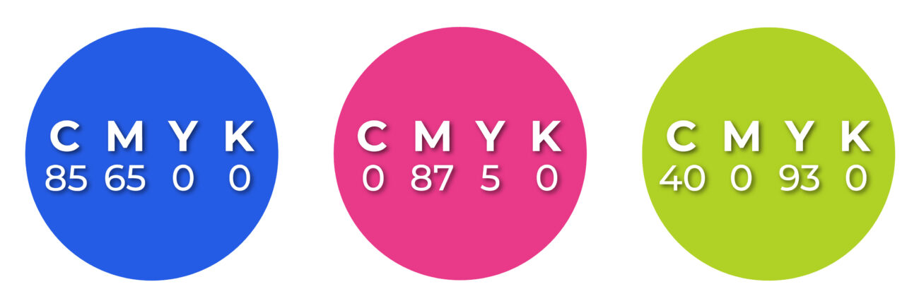
When we use CMYK in a design, we assign a value to each colour and this then mixes these colours together when printed. So, if you look at our print design work you may see values such as C:2 M:23 Y:9 K:15.
CMYK tends to be used for print design mostly as the colours are not as vibrant as we would like when used digitally.
RGB
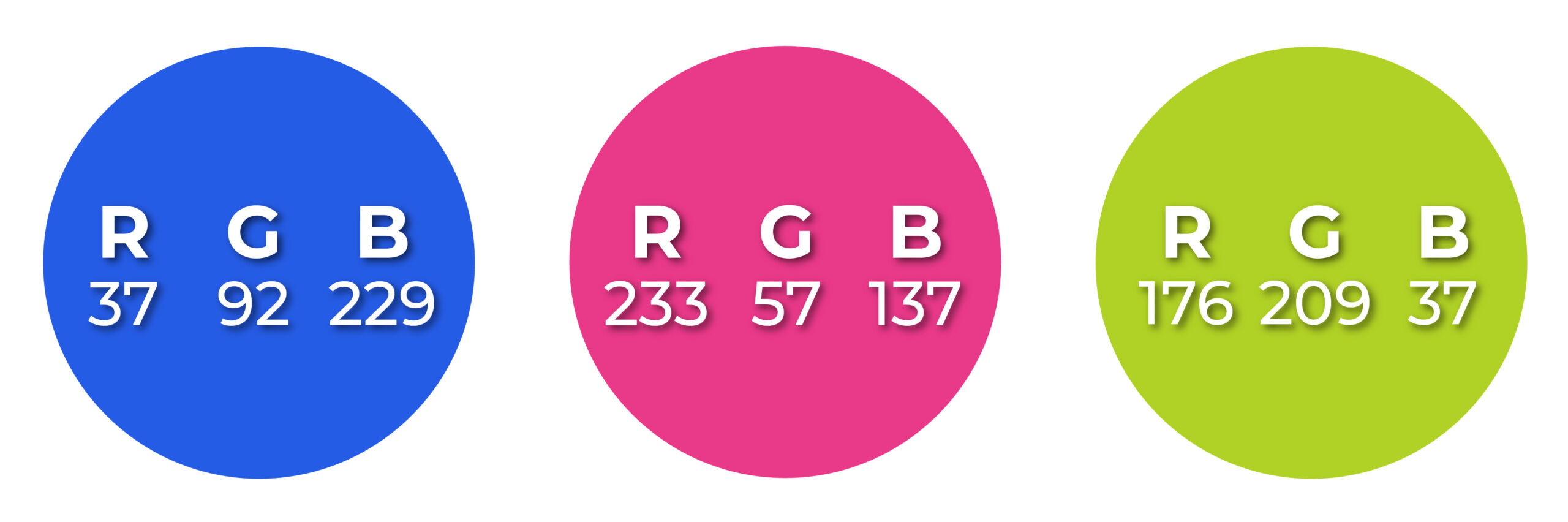
At the other end of the spectrum is RGB, which is mainly used for digital purposes only and not printed work. RGB stands for Red, Green and Blue and it works by mixing different combinations of red, green and blue in a similar way to how CMYK works.
However, there is one big difference between CMYK and RGB – and this is the vibrancy of the colours. RGB is used for digital work because it is able to access the large range of colour that digital screens allow us to use. If you printed a piece of RGB work, however, you would be disappointed as it would be duller and not as intense as it looked on screen.
One important thing to keep in mind is that RGB colours are device-dependent – so different devices will display RGB colours differently. If you look at a piece on someone’s laptop and then look at it on your own laptop it could potentially look very different – it depends on the device as to what colour is displayed.
Hex

Last but not least we have Hex colours, which are used on-screen for websites. Hex stands for hexadecimal and these colours tend to be used by our web developers and designers.
Hex is basically a 6-character code used to define colours, based on RGB. So one part of the code is for Red, one part is for Green, and one part for Blue. The characters used vary from 0 to 9 and A to F, so white is #FFFFFF while violet is #EE82EE.
Pantone
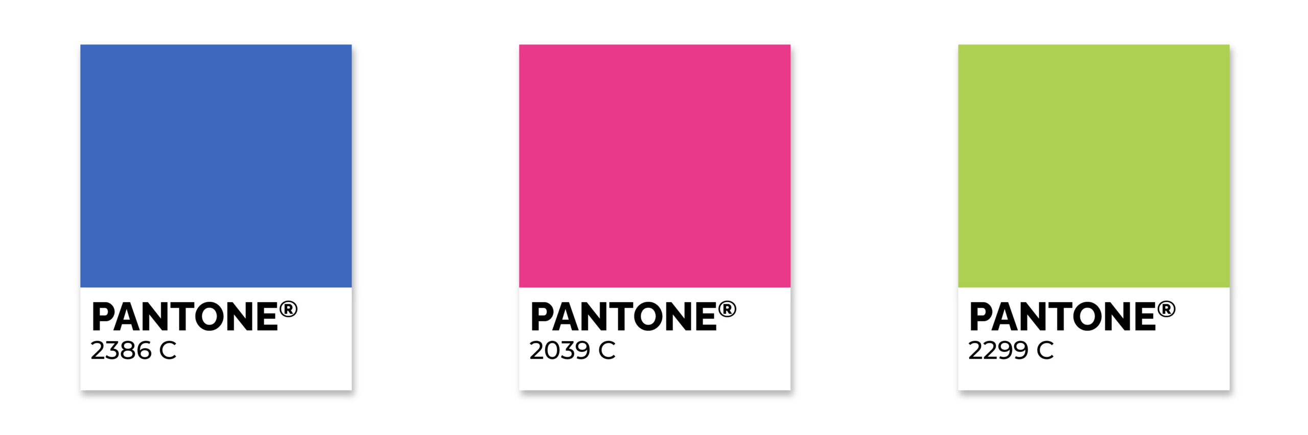
Another colour palette you may have heard of is Pantone, which is sometimes called Pantone Matching System (PMS) – and these are patented colours that are made from Pantone themselves.
The interesting thing about Pantone colours is that instead of mixing colours like the CYMK system, they use a solid colour, sometimes called spot colour. The patented system means that Pantone colours are universal whenever they are used, ensuring strict colour consistency.
Now, this might sound ideal, especially when you realise that Pantone offers many swatches and physical books to help you match their colours for your print project – however, it can pretty quickly get very expensive – especially when there are lots of colours involved.
Hopefully, this article has helped to make you more aware of how important colour is in design, as colour and branding cannot be treated separately as they offer a unified message of the meaning behind your brand. Colour is a really powerful thing, and so understanding what types of colours there are and how they should be used is vital.
So, before you start your next branding project – whether it be a website redesign or some print materials, get in touch with Zool and let us help you.
CMYK, Hex & RGB: What do they mean?
Creative / Aug 2, 2021
The creative team here at Zool talk about things like CMYK and RGB all day long, but if you’re not familiar with working with colour then you probably don’t have a clue what they are talking about.
Colour is a vital part of any of the branding work that we do, and keeping colours consistent across both digital and print is vital – especially when you realise that colour is important for establishing a strong and consistent message as it boosts brand recognition by over 80%.
However, getting this consistency of colour is not easy, just ask one of our graphic designers! With the variety of different screens in use in the world and different printers, it is often the case that one consistent colour does not look the same across all of the different collateral it is used on.
The world of colour for digital and print is really complex, but in this post, we want to try and break it down a little, to help you understand the different colour modes and values, and when we use them.
CMYK
If we go right back to basics, CMYK stands for Cyan, Magenta, Yellow and Key. It is also sometimes known as ‘four colour’ or ‘process colour’ and is easiest to think of as Blue, Red, Yellow and Black.
The cool thing about CMYK is that it is basically the process used to create any colour. We can overlap tiny dots of cyan, magenta, yellow and key to make any colour we desire. In fact, if you took a piece of printed material, such as a brochure or a business card, and put it under a very strong microscope you would be able to see a lot of little dots.
When we use CMYK in a design, we assign a value to each colour and this then mixes these colours together when printed. So, if you look at our print design work you may see values such as C:2 M:23 Y:9 K:15.
CMYK tends to be used for print design mostly as the colours are not as vibrant as we would like when used digitally.
RGB
At the other end of the spectrum is RGB, which is mainly used for digital purposes only and not printed work. RGB stands for Red, Green and Blue and it works by mixing different combinations of red, green and blue in a similar way to how CMYK works.
However, there is one big difference between CMYK and RGB – and this is the vibrancy of the colours. RGB is used for digital work because it is able to access the large range of colour that digital screens allow us to use. If you printed a piece of RGB work, however, you would be disappointed as it would be duller and not as intense as it looked on screen.
One important thing to keep in mind is that RGB colours are device-dependent – so different devices will display RGB colours differently. If you look at a piece on someone’s laptop and then look at it on your own laptop it could potentially look very different – it depends on the device as to what colour is displayed.
Hex
Last but not least we have Hex colours, which are used on-screen for websites. Hex stands for hexadecimal and these colours tend to be used by our web developers and designers.
Hex is basically a 6-character code used to define colours, based on RGB. So one part of the code is for Red, one part is for Green, and one part for Blue. The characters used vary from 0 to 9 and A to F, so white is #FFFFFF while violet is #EE82EE.
Pantone
Another colour palette you may have heard of is Pantone, which is sometimes called Pantone Matching System (PMS) – and these are patented colours that are made from Pantone themselves.
The interesting thing about Pantone colours is that instead of mixing colours like the CYMK system, they use a solid colour, sometimes called spot colour. The patented system means that Pantone colours are universal whenever they are used, ensuring strict colour consistency.
Now, this might sound ideal, especially when you realise that Pantone offers many swatches and physical books to help you match their colours for your print project – however, it can pretty quickly get very expensive – especially when there are lots of colours involved.
Hopefully, this article has helped to make you more aware of how important colour is in design, as colour and branding cannot be treated separately as they offer a unified message of the meaning behind your brand. Colour is a really powerful thing, and so understanding what types of colours there are and how they should be used is vital.
So, before you start your next branding project – whether it be a website redesign or some print materials, get in touch with Zool and let us help you.