
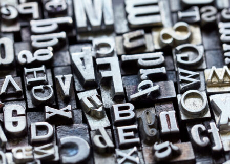
All of us are constantly digesting the written word these days whether it’s on websites or on our phones. From shop fronts to instruction books and social media, type is all around us.
We often think about the power of the written word, but how often do you think about the graphic designer’s role in emulating the tone of a word or a sentence?
The team of graphic designers here at Zool really work hard at considering the relationship between what words actually say and how they look. Did you know that different atmospheres, emotions and moods can be expressed simply through your choice of type?
But what exactly is typography and why is it so important?
What is typography?
Typography is the art of arranging letters and text in a way that makes the copy clear, legible and visually appealing to a reader. It involves blending font appearance, font style and font structure in a way that conveys specific messages and elicits certain emotions.
Typography is what brings your text to life.
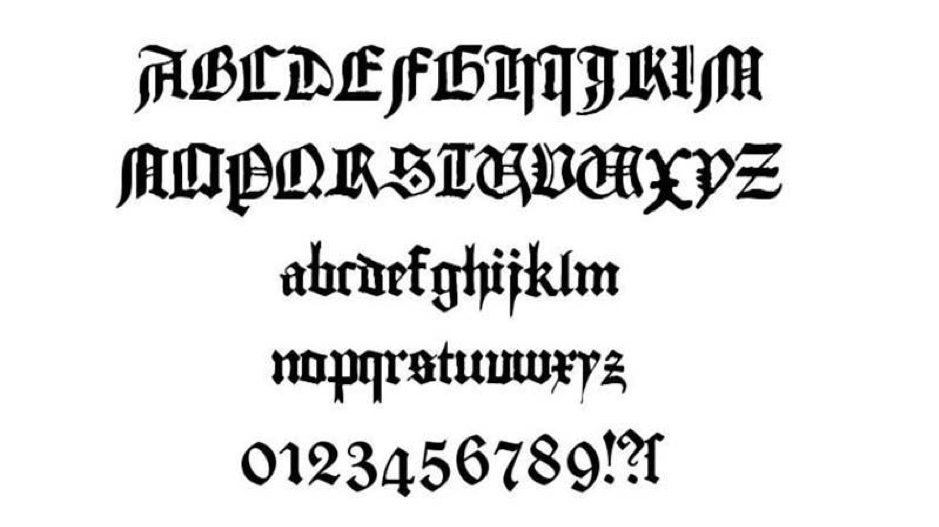
Typography’s roots can be traced back to around the 11th century when movable type was first introduced. Typography began as a specialist craft associated with books and public works, and eventually magazines. The first example of typography can be seen in the Gutenberg Bible, the earliest major book printed. This used the font Textura that is still around today.
Fast forward to today and typography tends to be associated more with both print and the digital world. Typography really exploded with the advent of the internet, as web designers suddenly had an abundance of fonts at their disposal making typography more diverse than ever before.
Why is typography so important?
But typography is so much more than just making the written word look beautiful, it is a vital part of user interface design.
Getting your typography right means not only establishing a strong visual identity for your brand but also setting the overall tone of your product and providing a graphic balance to your site.
Typography can guide and inform your customers, optimise their reading experience and accessibility, and ensure they receive an excellent customer experience every time they interact with you.
Let’s take a closer look at why typography is so important:
- Brand recognition. Your customers will start to associate the typeface featured on your site with your brand, subliminally. So, if you use consistent, unique typography you can establish a strong customer following, build trust with your customers and help carry your brand forward.
- Decision making. Typography affects how customers digest and perceive the information conveyed by your text. So, eye-catching fonts will be more persuasive than weak ones that don’t reinforce the message of the text.
- Attention holding. You may not believe it, but good typography can be the difference between someone staying on your website for one minute or ten minutes. Your website needs to be visually stimulating and memorable to catch people’s attention and engage them, and typography has a huge part to play in this.
Seven different elements of typography
#Element one: Fonts & Typefaces
We have noticed that there is some confusion between fonts and typefaces, with many people treating the two as if they are the same thing. They’re not.
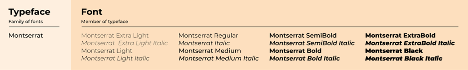
A font is a graphical representation of a text character, whereas a typeface is a design style comprising a variety of characters of varying sizes and weights.
Put simply, a typeface is an entire family of fonts (of different weights) while a font is a member of a typeface.
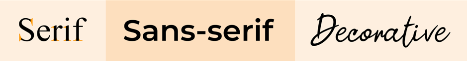
There are three basic kinds of typeface: serif, sans serif and decorative. A good graphic designer will never use more than three fonts on one design – and will keep decorative fonts to a minimum.
For maximum UI we recommend pairing a serif font with a sans-serif font.
#Element two: Contrast
Contrast helps to convey which ideas or messages you want to emphasize to your readers, making your text more interesting, meaningful and attention-grabbing. Designers create contrast by playing around with typefaces, colours, styles and sizes to create the most impact and break up the page.
#Element three: Consistency
Making sure you keep your typefaces consistent is key to avoiding a messy and confusing interface. You should try to stick to the same font style when conveying any information relating to your brand so that customers understand what they are reading instantly, and also begin to notice a pattern.\
It is good practice, therefore, to establish a consistent hierarchy of typefaces, one font for headers and one for subheadings, and stick to them.
#Element four: White Space
Sometimes referred to as ‘negative space’, white space is the space around text or graphics on a page. It tends to be overlooked by most people, but proper use of white space ensures the text is not only readable, but the interface is uncluttered as well.
White space can even be used to draw attention to the text and make it a more aesthetically pleasing experience overall.
#Element five: Alignment
Alignment is the word used to describe the process of composing text, images and graphics to ensure there is equal space, size and distance between each element.
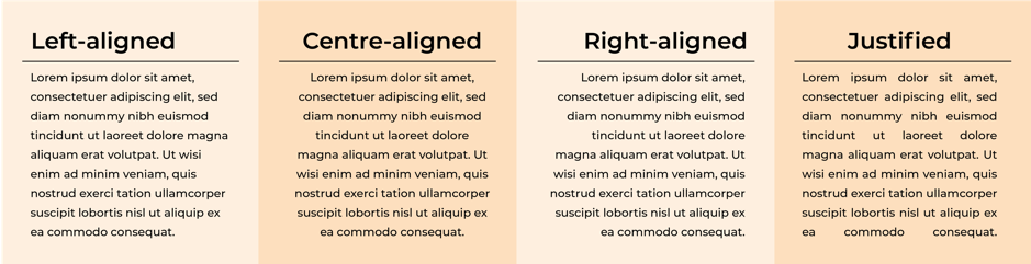
It is always good practice to pay attention to industry standards when it comes to aligning your user interface, for example, most readers read left to right so it would make no sense to align your text to the right.
#Element six: Colour
Colour is one of the most exciting elements of typography as it is where designers can really get creative and elevate the design to the next level.
However, text colour is not a subject to be taken lightly. Getting your font colour right can make the text stand out and convey the tone of your message, but getting it wrong can result in text that clashes with your site’s colours and create a messy interface.
Colour consists of three key components: hue, saturation and value, and good designers know how to balance these three to make text eye-catching and clearly legible.
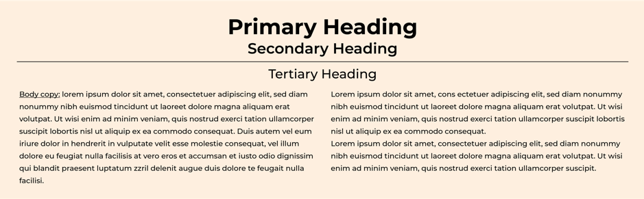
#Element seven: Hierarchy
Establishing typographical hierarchy is one of the key principles of typography as it aims to create a clear distinction between prominent pieces of text that should be read first, and standard text.
We all have shorter attention spans these days, thanks to social media, and so designers tend to be more concise and use typefaces that allow users to consume the information they need in a short amount of time.
Hierarchy is created through the use of alignment, colour, contrast and sizing.
How do we choose the right typeface for your website?
With so many different elements to think about, and so many fonts and typefaces to choose from, it can be overwhelming for our clients to decide. It is about so much more than just seeing what looks nice.
Some of the things we take into account are:
- The personality of the brand. What do we want customers to feel when they first enter the website? A good starting point is to define the core traits of the brand and then gather typefaces that reflect those traits.
- The tone of the brand. It is also important to think about how the font conveys the tone of the message. So, a less stylized font is best for conveying important or serious information.
- Function as well as form. Is the font accessible, legible and readable? You don’t want customers clicking the wrong button because the instructions were unclear.
- Is the typeface web browser friendly? Can they be rendered perfectly by web browsers without any issues?
Conclusion
Typography is often overlooked by business owners, but it is a crucial component of user interface design.
If you’re not sure where to start with your brand’s typography, talk to the team at Zool.
Typography: What is it & why is it important?
Creative / Sep 27, 2021
All of us are constantly digesting the written word these days whether it’s on websites or on our phones. From shop fronts to instruction books and social media, type is all around us.
We often think about the power of the written word, but how often do you think about the graphic designer’s role in emulating the tone of a word or a sentence?
The team of graphic designers here at Zool really work hard at considering the relationship between what words actually say and how they look. Did you know that different atmospheres, emotions and moods can be expressed simply through your choice of type?
But what exactly is typography and why is it so important?
What is typography?
Typography is the art of arranging letters and text in a way that makes the copy clear, legible and visually appealing to a reader. It involves blending font appearance, font style and font structure in a way that conveys specific messages and elicits certain emotions.
Typography is what brings your text to life.
Typography’s roots can be traced back to around the 11th century when movable type was first introduced. Typography began as a specialist craft associated with books and public works, and eventually magazines. The first example of typography can be seen in the Gutenberg Bible, the earliest major book printed. This used the font Textura that is still around today.
Fast forward to today and typography tends to be associated more with both print and the digital world. Typography really exploded with the advent of the internet, as web designers suddenly had an abundance of fonts at their disposal making typography more diverse than ever before.
Why is typography so important?
But typography is so much more than just making the written word look beautiful, it is a vital part of user interface design.
Getting your typography right means not only establishing a strong visual identity for your brand but also setting the overall tone of your product and providing a graphic balance to your site.
Typography can guide and inform your customers, optimise their reading experience and accessibility, and ensure they receive an excellent customer experience every time they interact with you.
Let’s take a closer look at why typography is so important:
- Brand recognition. Your customers will start to associate the typeface featured on your site with your brand, subliminally. So, if you use consistent, unique typography you can establish a strong customer following, build trust with your customers and help carry your brand forward.
- Decision making. Typography affects how customers digest and perceive the information conveyed by your text. So, eye-catching fonts will be more persuasive than weak ones that don’t reinforce the message of the text.
- Attention holding. You may not believe it, but good typography can be the difference between someone staying on your website for one minute or ten minutes. Your website needs to be visually stimulating and memorable to catch people’s attention and engage them, and typography has a huge part to play in this.
Seven different elements of typography
#Element one: Fonts & Typefaces
We have noticed that there is some confusion between fonts and typefaces, with many people treating the two as if they are the same thing. They’re not.
A font is a graphical representation of a text character, whereas a typeface is a design style comprising a variety of characters of varying sizes and weights.
Put simply, a typeface is an entire family of fonts (of different weights) while a font is a member of a typeface.
There are three basic kinds of typeface: serif, sans serif and decorative. A good graphic designer will never use more than three fonts on one design – and will keep decorative fonts to a minimum.
For maximum UI we recommend pairing a serif font with a sans-serif font.
#Element two: Contrast
Contrast helps to convey which ideas or messages you want to emphasize to your readers, making your text more interesting, meaningful and attention-grabbing. Designers create contrast by playing around with typefaces, colours, styles and sizes to create the most impact and break up the page.
#Element three: Consistency
Making sure you keep your typefaces consistent is key to avoiding a messy and confusing interface. You should try to stick to the same font style when conveying any information relating to your brand so that customers understand what they are reading instantly, and also begin to notice a pattern.\
It is good practice, therefore, to establish a consistent hierarchy of typefaces, one font for headers and one for subheadings, and stick to them.
#Element four: White Space
Sometimes referred to as ‘negative space’, white space is the space around text or graphics on a page. It tends to be overlooked by most people, but proper use of white space ensures the text is not only readable, but the interface is uncluttered as well.
White space can even be used to draw attention to the text and make it a more aesthetically pleasing experience overall.
#Element five: Alignment
Alignment is the word used to describe the process of composing text, images and graphics to ensure there is equal space, size and distance between each element.
It is always good practice to pay attention to industry standards when it comes to aligning your user interface, for example, most readers read left to right so it would make no sense to align your text to the right.
#Element six: Colour
Colour is one of the most exciting elements of typography as it is where designers can really get creative and elevate the design to the next level.
However, text colour is not a subject to be taken lightly. Getting your font colour right can make the text stand out and convey the tone of your message, but getting it wrong can result in text that clashes with your site’s colours and create a messy interface.
Colour consists of three key components: hue, saturation and value, and good designers know how to balance these three to make text eye-catching and clearly legible.
#Element seven: Hierarchy
Establishing typographical hierarchy is one of the key principles of typography as it aims to create a clear distinction between prominent pieces of text that should be read first, and standard text.
We all have shorter attention spans these days, thanks to social media, and so designers tend to be more concise and use typefaces that allow users to consume the information they need in a short amount of time.
Hierarchy is created through the use of alignment, colour, contrast and sizing.
How do we choose the right typeface for your website?
With so many different elements to think about, and so many fonts and typefaces to choose from, it can be overwhelming for our clients to decide. It is about so much more than just seeing what looks nice.
Some of the things we take into account are:
- The personality of the brand. What do we want customers to feel when they first enter the website? A good starting point is to define the core traits of the brand and then gather typefaces that reflect those traits.
- The tone of the brand. It is also important to think about how the font conveys the tone of the message. So, a less stylized font is best for conveying important or serious information.
- Function as well as form. Is the font accessible, legible and readable? You don’t want customers clicking the wrong button because the instructions were unclear.
- Is the typeface web browser friendly? Can they be rendered perfectly by web browsers without any issues?
Conclusion
Typography is often overlooked by business owners, but it is a crucial component of user interface design.
If you’re not sure where to start with your brand’s typography, talk to the team at Zool.