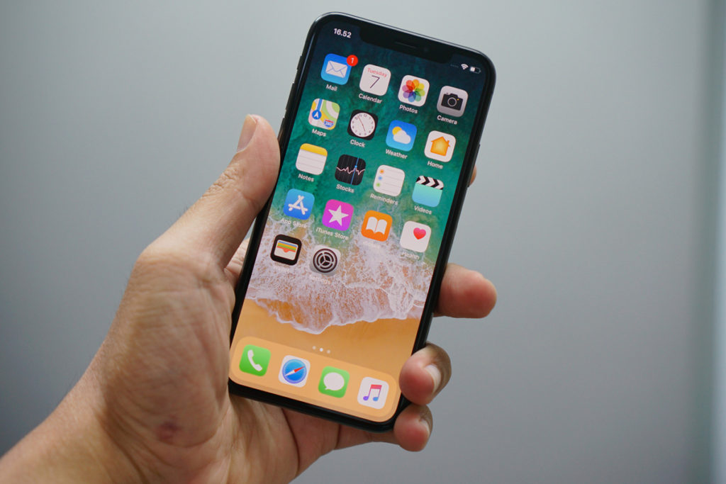
We are living in the age of digital; with the ever-increasing preeminence of mobiles and tablets, the internet is always at our fingertips. Nowadays, the majority of people access the internet using hand-held devices, such as mobiles and tablets.
This shift in usage means that all businesses should set as a priority that their websites are mobile-friendly. Responsive Web Design means that your website will detect what sort of device it is being viewed on, and automatically adapt and reshape itself to fit the screen that it is being viewed on.
Here’re some crazy stats for you:
- In 2017, figures suggest that more than 63.4% of mobile phone users will access online content through their devices.
- Today, 189 million Facebook users are ‘mobile-only’ thanks to smartphones.
- There are almost as many mobile phone subscriptions in the world as people, a United Nations telecom agency has said.
- A recent study found that people spend an average of 23 days a year on their phones, which amounts to 3.9 years of the average person’s life!
- 82% of TV ad-driven searches during the Super Bowl happened on smartphones. Overall, the ads drove more than 7.5 million incremental searches during the game.
New updates to Google’s algorithm, the method it uses to rank search engine results, will adversely affect non-responsive websites. If your website isn’t mobile-friendly it will be penalised and will automatically be ranked lower.
E.g. We run an SEO campaign for a client which has helped them to consistently rank very highly for their relevant search terms, despite having an unresponsive website. We knew that it was only a matter of time before this became an obstacle and sure enough, after the most recent algorithm updates this website has plummeted in search results. Google notified us that this was due to its unresponsive design, so the only way to increase rankings again is through responsive web design.
Don’t risk being left behind, being overtaken by your competitors and missing out on business by having a non-responsive website. Make sure that your site is optimised for the mobile internet!
For more information on responsive website design or our other digital marketing services, please contact Zool on 01625 238770 or email us at [email protected].
63% of Mobile Phone Users Will Access Online Content Through Their Devices
Digital / Apr 29, 2016
We are living in the age of digital; with the ever-increasing preeminence of mobiles and tablets, the internet is always at our fingertips. Nowadays, the majority of people access the internet using hand-held devices, such as mobiles and tablets.
This shift in usage means that all businesses should set as a priority that their websites are mobile-friendly. Responsive Web Design means that your website will detect what sort of device it is being viewed on, and automatically adapt and reshape itself to fit the screen that it is being viewed on.
Here’re some crazy stats for you:
- In 2017, figures suggest that more than 63.4% of mobile phone users will access online content through their devices.
- Today, 189 million Facebook users are ‘mobile-only’ thanks to smartphones.
- There are almost as many mobile phone subscriptions in the world as people, a United Nations telecom agency has said.
- A recent study found that people spend an average of 23 days a year on their phones, which amounts to 3.9 years of the average person’s life!
- 82% of TV ad-driven searches during the Super Bowl happened on smartphones. Overall, the ads drove more than 7.5 million incremental searches during the game.
New updates to Google’s algorithm, the method it uses to rank search engine results, will adversely affect non-responsive websites. If your website isn’t mobile-friendly it will be penalised and will automatically be ranked lower.
E.g. We run an SEO campaign for a client which has helped them to consistently rank very highly for their relevant search terms, despite having an unresponsive website. We knew that it was only a matter of time before this became an obstacle and sure enough, after the most recent algorithm updates this website has plummeted in search results. Google notified us that this was due to its unresponsive design, so the only way to increase rankings again is through responsive web design.
Don’t risk being left behind, being overtaken by your competitors and missing out on business by having a non-responsive website. Make sure that your site is optimised for the mobile internet!
For more information on responsive website design or our other digital marketing services, please contact Zool on 01625 238770 or email us at [email protected].
Array
